Furnify
A modern homepage redesign with customer UX in mind, from design stage to using Magento 2’s powerful pagebuilder to make use of the latest functionalities.
Services Used
Client Link
BACKGROUND
Furnify offer a range of office furniture to elevate the workspace, covering everything from environment planning to delivery and installations.
BRIEF
As a long standing Magento 2 client, Furnify approached Absolute with a plan to modernise their dated homepage to better portray the key messages and content in the office furniture sector and to improve on their UX for a more suitable customer journey.
We had also been working on another site for a related business of Furnify’s, due to launch shortly, and after being impressed with the design process for this project, Furnify decided that their site would benefit from the same approach.
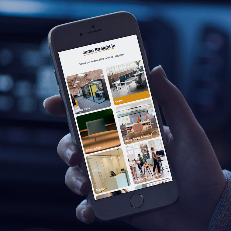
Since Furnify are on a fully supported version of Magento which enables the core page builder module, we were able to create the homepage with customisable blocks, rather than HTML - this gives the client much more flexibility and following a training session, they can now make layout and/or content changes themselves without needing developer assistance.
HOW WE HELPED
Furnify asked us to modernise the homepage to better reflect the office furniture sector, with more intuitive functionality to get ahead of their competitors.
Initially, this required a meeting to understand the client’s needs and wants, so we could put together a scope of work that would meet all their requirements. Following on from that, once we had the brief confirmed, the project went into a wireframing and design stage so Furnify could envisage how the homepage looked before it went into development.
The design of the old homepage was very dated and due to lots of “small fixes” it had started to become disjointed and unclear. The main aim to come out of the design workshop was to fix this and to make sure the whole homepage ran smoothly from section to section. We also needed to make the CTAs clear and obvious to help maximise lead generation. All of this, combined with some newly designed elements and content blocks, helped bring this new homepage design to life.
After the homepage design was completed for desktop, we had to create a mobile version to make sure the site worked seamlessly across all devices. Designing a website for mobile devices requires a meticulous approach to ensure optimal user experience on smaller screens. This involves employing responsive design techniques, such as prioritising intuitive navigation and touch-friendly elements for effortless interaction on touchscreens.
Once the designs were completed, we went through a quick feedback exercise with the client, to make sure that they were happy with what we had created.
The homepage was then built according to spec; easy to navigate bold category images with clear and concise blocks so customers are informed on Furnify’s offerings at a glance.
CONTACT
Get in touch to see how we can build you a Magento or Shopify site or maybe support you in the day-to-day running of your existing site.
Please get in touch for a no obligation, highly accurate estimate and timeline for a new Magento or Shopify eCommerce site.

CASE STUDIES

Pantherella
Magento 1 migration, front-end development, and Magento 2 support for sock manufacturer Pantherella. Learn more about our work with Pantherella.
-
Magento -
-
Support
Fired Earth UX Improvements
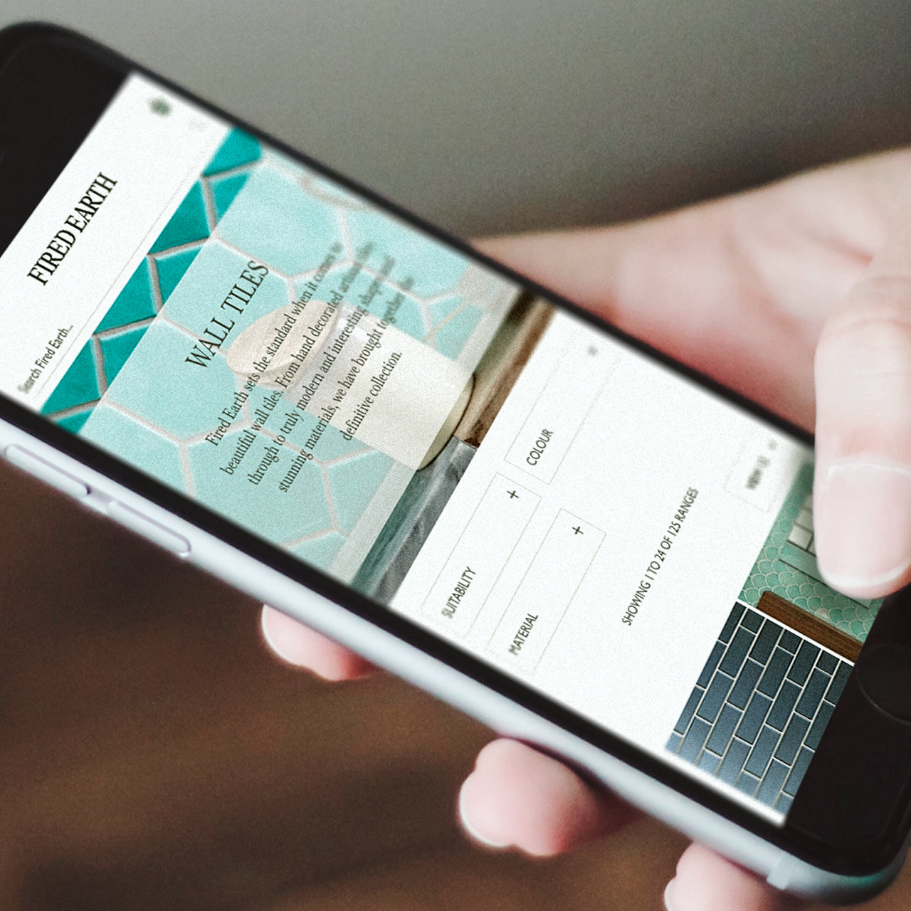
Absolute worked with Fired Earth to deliver a programme of UX improvements.
-
Magento -
-
Support
SGS Engineering
Magento 1 to Magento 2 Open Source Migration Success for SGS Engineering.
-
Magento -
-
Support

Fired Earth
A design and user experience study for a legendary lifestyle brand plus migrating their ecommerce store from Magento1 Enterprise to M2 Commerce Edition.
-
Magento -
-
Support

Embody
Driving revenue and improving overall performance for Embody, using our expertise in Magento, eCommerce, UX, and web design and development.
-
Magento -
-
Support
We are always on the lookout for like-minded and talented people who can work in a team to a high standard. Send us your CV along with your previous experience.
Enter your email address to sign up to our newsletter, featuring case studies, insights, industry news and much more.
