Fired Earth UX Improvements
Absolute worked with Fired Earth to deliver a programme of UX improvements.
Services Used
Client Link

BACKGROUND
Fired Earth successfully launched their Magento 2 eCommerce website with Absolute in 2018.
Since the launch of the site, their product range has grown exponentially and this, combined with new business requirements, meant it was a good time to improve the site's user experience.

BRIEF
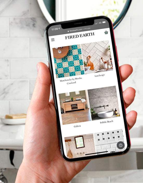
Initially undertaking a conversion rate optimisation (CRO) audit, we audited the sites key pages: Homepage, Main navigation, Product list page and Filters. We introduced a more compact header to better utilise space, and an integrated on-page search that allows users to browse visual search results without having to navigate to separate result pages.
HOW WE HELPED
Improved page headers grab the users’ attention, and provision for video backgrounds in order to increase the impact of range pages.
To further enhance the mobile experience, we moved from an on-page component to a mobile-first slide-out filters panel. This means users can now easily navigate through filters whilst precious screen real estate is utilised effectively. This also creates a more device agnostic, consistent mobile and desktop experience.
Additionally, the mega menu we built for Fired Earth now provides a full-width solution with quick access to all areas of the website. This includes embedded colour swatches and imagery detailing the latest ranges.
CONTACT
To see how Absolute can improve your Magento 2 conversion rates and receive a free UX audit, contact us!

Find out more about our work for Fired Earth here
CASE STUDIES

Pantherella
Magento 1 migration, front-end development, and Magento 2 support for sock manufacturer Pantherella. Learn more about our work with Pantherella.
-
Magento -
-
Support

Furnify
A modern homepage redesign with customer UX in mind, from design stage to using Magento 2’s powerful pagebuilder to make use of the latest functionalities.
-
Magento -
-
Support

SGS Engineering
Magento 1 to Magento 2 Open Source Migration Success for SGS Engineering.
-
Magento -
-
Support

Fired Earth
A design and user experience study for a legendary lifestyle brand plus migrating their ecommerce store from Magento1 Enterprise to M2 Commerce Edition.
-
Magento -
-
Support

Embody
Driving revenue and improving overall performance for Embody, using our expertise in Magento, eCommerce, UX, and web design and development.
-
Magento -
-
Support
We are always on the lookout for like-minded and talented people who can work in a team to a high standard. Send us your CV along with your previous experience.
Enter your email address to sign up to our newsletter, featuring case studies, insights, industry news and much more.
