Fired Earth
Client Link

KEY RESULTS
-
0
%Increase in conversion rate
-
0
%Increase in load speed
BACKGROUND
A design and user experience study for a legendary lifestyle brand plus migrating their eCommerce store from Magento 1 Enterprise to M2 Commerce Edition.

BRIEF
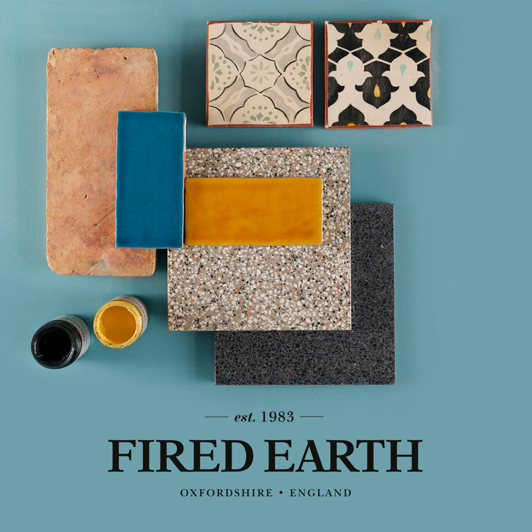
Fired Earth is a firmly established and trusted brand in the home sector, known for its influence on trends, high quality products and great design. In print and in-store the brand has been presented strongly, however, online the brand had become tired with a poor customer experience and a very dated looking site that was lagging behind the competition.
HOW WE HELPED
First of all, we needed to understand the business objectives and website goals before prioritising these for the client. We looked at all existing analytics for their current website and also conducted heat mapping research on the site, using empathy maps to take the user journey research to the next level.
This allowed us to understand the different customer types and their profiles. From here we were able to investigate each of their user journeys from initially landing on the site through to making a purchase for each different product type, for instance tiles, paint, bathrooms and kitchens.
Using the intelligence and insights gathered from the workshop we moved into the UX and planning phase to map out user journeys, create a sitemap and wireframe templates, featuring new functionality and widgets.
Working collaboratively with the client, we refined our understanding to create a design solution that both answered their needs, overcame the issues they were struggling with online and strategically moved the online experience forward by creating an effortless and memorable transaction.
The next step was to turn our wireframes into a working prototype of the site so the client could get a better understanding of how it felt to navigate the shop as a customer and use the new features and functionality. This allowed us to collaborate intelligently, reviewing and refining the transactional process and the design solution.
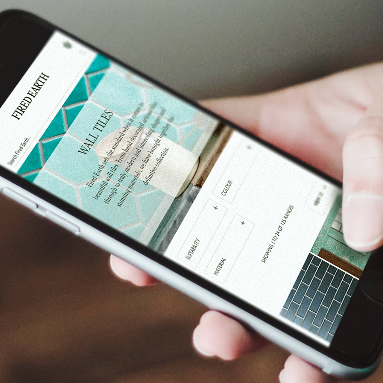
Next, we moved onto the design phase of the site. Using our learning’s from the brand audit and workshop, we were able to confidently take the essence of the brand, our understanding of the brand style and conceive a creative direction that brought the online brand experience up to the same high level of the print and in-store experience.
We implemented the approved design and developed their new website using Magento 2 Commerce.
The scope of work included migrating existing customers and products, adding new ranges and introducing configurable products to further improve user experience. Our in-house certified Magento development team also implemented numerous bespoke elements taking the time to optimise and improve on the sites original Magento 1 modules. This included the concept of product ranges vs standard product categories, per m2 pricing, a tile calculator, product samples, complex shipping rules based on product ‘groups’ and combined weights along with consideration for mix ‘group’ baskets, plus integrating with Emarsys, an automated marketing solution.

Find out more about the work we have done for Fired Earth
CONTACT
Get in touch to see how we can build you a Magento or Shopify site or maybe support you in the day-to-day running of your existing site.
Please get in touch for a no obligation, highly accurate estimate and timeline for a new Magento or Shopify eCommerce site.

CASE STUDIES

Pantherella
Magento 1 migration, front-end development, and Magento 2 support for sock manufacturer Pantherella. Learn more about our work with Pantherella.
-
Magento -
-
Support

Fired Earth UX Improvements
Absolute worked with Fired Earth to deliver a programme of UX improvements.
-
Magento -
-
Support

Furnify
A modern homepage redesign with customer UX in mind, from design stage to using Magento 2’s powerful pagebuilder to make use of the latest functionalities.
-
Magento -
-
Support

SGS Engineering
Magento 1 to Magento 2 Open Source Migration Success for SGS Engineering.
-
Magento -
-
Support

Embody
Driving revenue and improving overall performance for Embody, using our expertise in Magento, eCommerce, UX, and web design and development.
-
Magento -
-
Support
We are always on the lookout for like-minded and talented people who can work in a team to a high standard. Send us your CV along with your previous experience.
Enter your email address to sign up to our newsletter, featuring case studies, insights, industry news and much more.
