Shredall
Shredall and Absolute have a relationship which goes back over 10 years, they recently approached us for a brand new Shopify website build, as the old site was built with an outdated Concrete5 platform and no longer met their requirements.
Services Used
Client Link

BACKGROUND
Total Information Management
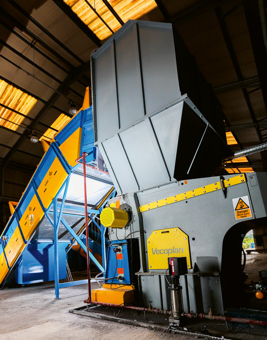
Shredall has over 20 years experience in the document management industry; servicing everything from secure storage to shredding and recycling. They have all the industry accreditations to be able to handle sensitive data, with rigorous security and stringent data protection policies to ensure customer data is handled correctly and securely.
We were approached by Shredall, whom we have a long standing relationship with, to build a new website to align them within their industry as the number one document management company. The previous site was built in Concrete5 - an outdated CMS platform with limited features and not very user friendly from a UX standpoint.
Shredall’s key requirements were to make the new website eye-catching, using their bold brand guidelines, and intuitive so the site is straightforward to navigate to help find the service you’re looking for. They also preferred to be able to make changes easily in-house without needing to request the help of a developer, so Shopify seemed like the right fit for their needs.
HOW WE HELPED
Absolute collaboratively designed the new website look and feel with Shredall, with a key focus of using their set brand guidelines and large images to make it visually appealing - with a few full bespoke pages which deviate from the Shopify theme layout used.
Absolute collaboratively designed the new website look and feel with Shredall, with a key focus of using their set brand guidelines and large images to make it visually appealing - with a few full bespoke pages which deviate from the Shopify theme layout used. The decision on what platform to use was easy - as we recently built their sister site Loft on Shopify, an all in one storage company, it made sense to continue with this so they could manage and make changes on both sites in the same way without having to retrain staff on a brand new CMS.
Shredall’s main objective was to make the website more visually appealing, we did this by including a video slider, showcasing the company’s large on-site facilities. We also included small animations and interactions across the site to catch the attention of the user on Shredall’s offerings.
Site hierarchy
Although Shopify makes creating visually rich layouts incredibly simple, it is primarily an eCommerce platform and not really designed for deep content sites. Where this can become apparent is that pages can’t be ‘nested’ under other pages. The previous Shredall site had a lot of top level pages that then had other pages within them that gave further detail about each topic - and this hierarchy was displayed within the URL and the breadcrumb trail on the page. So for example the /shredding/ page might then also have /shredding/on-site-shredding and /shredding/high-security-shredding/ as pages beneath it.
Shopify won’t natively allow that structure, but with a little ingenuity, we can present that hierarchy to search engines. When a page loads, the theme code looks through the main navigation to see if that page is listed there, and if it is, we can use that structure to create the breadcrumb which helps the user orientate themselves. But we can also add some additional information for Google to understand that hierarchy as well. By adding structured data [https://developers.google.com/search/docs/appearance/structured-data/breadcrumb] to this, Google gets an understanding of how the pages relate to each other.
Four level deep navigation
Shopify’s menu system only allows a 3 level deep structure to be created, and for most sites, this is plenty. But Shredall did have some particularly deep pages that were four levels deep. We wanted to preserve that structure to make the transition to the new site as easy as possible for both existing users and search engines, and so we came up with a system to extend Shopify’s navigation to allow a fourth level.
Heading hierarchy
Working with Shredall’s SEO partner while migrating the content raised a possible issue with the page structure. Ideally, we want a level 1 heading at the top of the page, and level 2 headings beneath that, and level 3 beneath those.
The theme has a wide range of different elements that can be dragged and dropped in the editor to create a visually interesting page, but because they can be placed anywhere, they often all have the same level heading and that organisation of the page can be lost.
Because of the nature of it, it’s a very difficult thing to create a set of rules that could automate those heading levels, but what we could do is extend each of the drag-and-drop sections so the SEO partner could select which level they wanted for each instance. This meant a bit of manual work, but it ensured that this important SEO and Accessibility structure was maintained.
DESIGN
To keep the project within budget, we opted for a bespoke homepage design and a bespoke content page.
Having a bespoke homepage allowed the site to feel more on brand and personal than a standard Shopify theme and although a Shopify theme comes with numerous content blocks to create in the page builder, some content requires a little more bespoke designing to make sure it is displayed effectively. This is why we also designed a bespoke content page, making sure that we designed enough content blocks to hold all the content from the old site. As long as the content page is then used correctly to build all the other pages, this is a great way to create what seems to be a bespoke website whilst using a hybrid budget.


CONTACT
Get in touch to see how we can build you a Magento or Shopify site or maybe support you in the day-to-day running of your existing site.
Please get in touch for a no obligation, highly accurate estimate and timeline for a new Magento or Shopify eCommerce site.

CASE STUDIES
Fired Earth - Shopify Plus
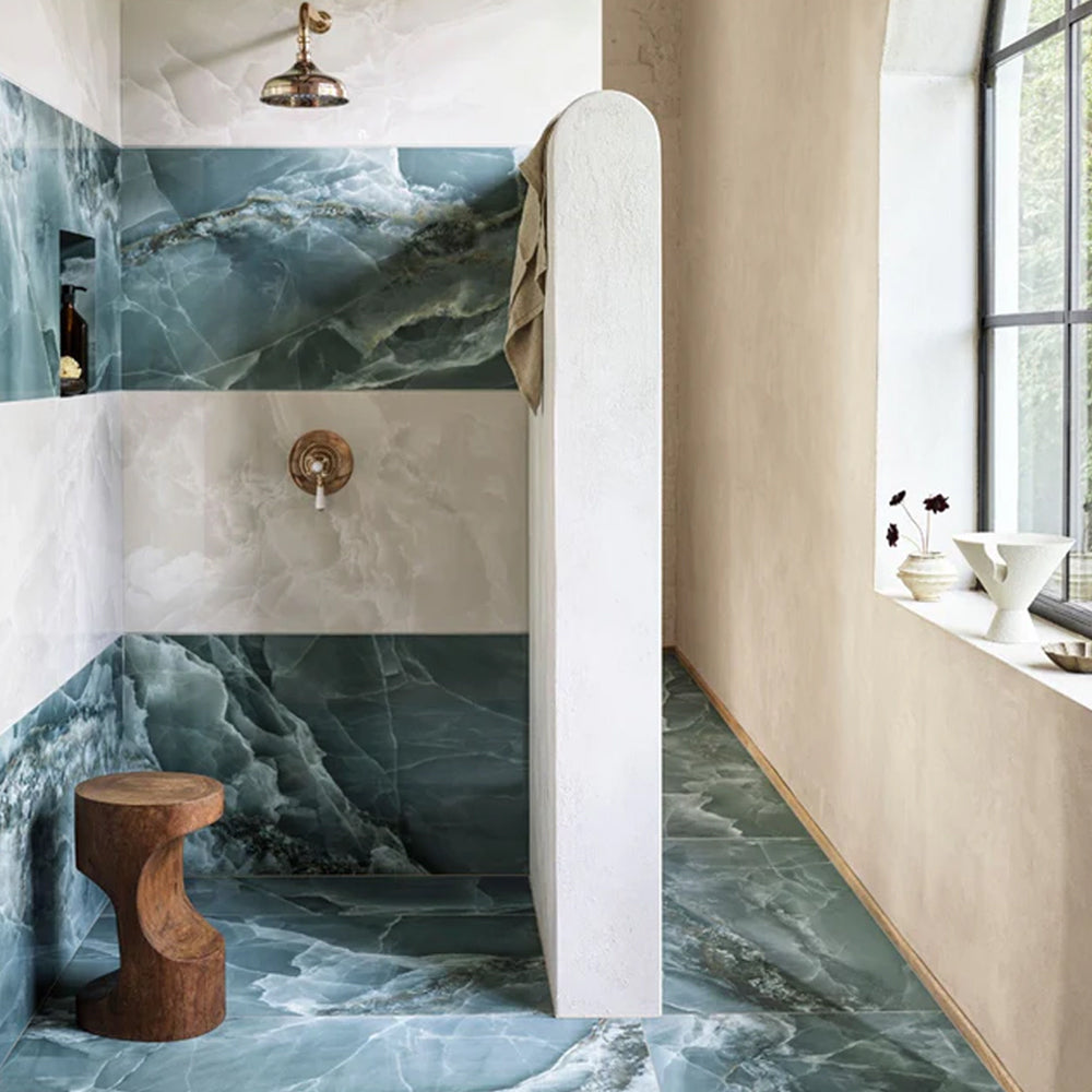
Fired Earth’s move to Shopify Plus marked a major transformation for their B2C and B2B operations, streamlining their product catalogue and delivering a faster, more adaptable eCommerce experience, supporting growth and enhanced customer engagement.
-
Shopify
Carluccio's Coffee Subscription
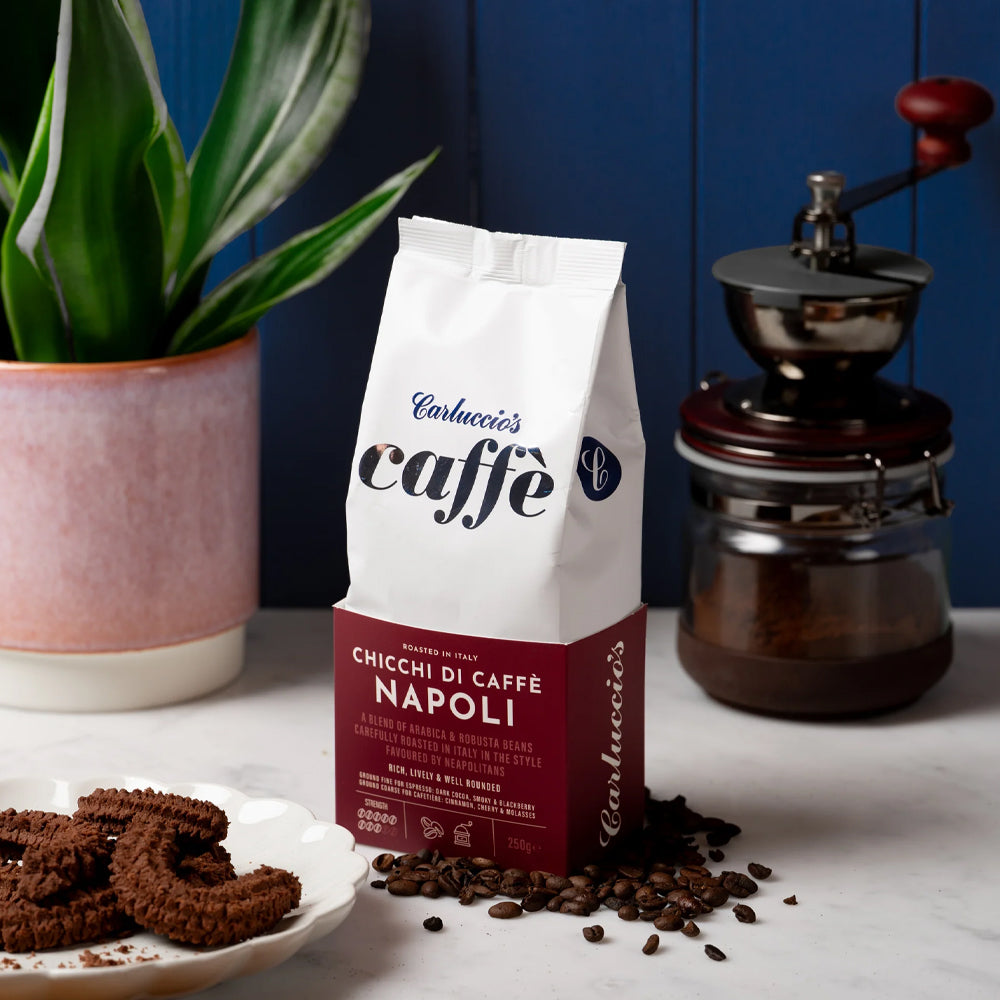
Discover how we helped Carluccio’s transform their online coffee products, creating a bespoke design, unique user journey and efficient user experience, resulting in an eye-catching subscription service, seamlessly integrated with their Shopify site.
-
Shopify
WinTech & King Racing
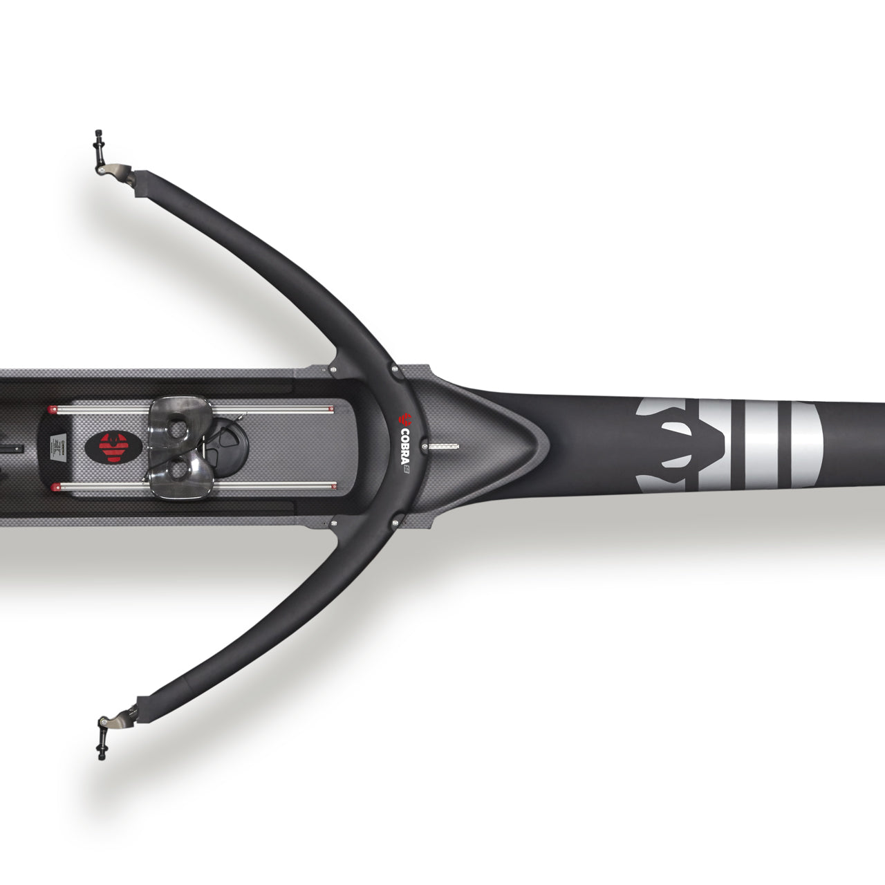
Creating a dual-branded, non-transactional Shopify site for WinTech and King Racing.
-
Shopify

Splash About - Shopify Plus
Discover how Splash About’s migration to Shopify Plus enabled faster product launches, stronger operational efficiency and a more intuitive experience for both retail and trade customers.
-
Shopify

Nuchido
Nuchido is a science-led health and wellness company that develops NAD+ supplements designed to support vitality, cognitive function, cellular health and long-term wellbeing through advanced, research-backed formulations.
-
Shopify

Visune
Visune Shopify Plus build is picture perfect.
-
Shopify

Dataman
We have worked with our long standing client Dataman, the leading supplier of device programmers, as they migrated from Magento to Shopify.
-
Shopify

Little Skiers
Since their inception in 2008, Little Skiers has been at the forefront of providing high-quality ski wear for kids. Recognising the need to evolve digitally, they embarked on a strategic migration to Shopify, aiming for a more streamlined and user-friendly online presence.
-
Shopify

Gattertop
From migrating legacy data and introducing subscription models to enhancing user experience with handwritten gift messages, discover how we delivered a cost-effective, robust solution on Shopify, setting the stage for the brand's growth.
-
Shopify
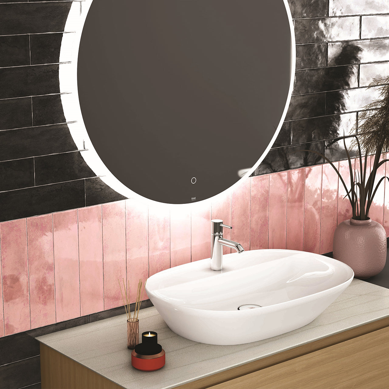
Porcelain Ceramics
Shopify was the platform of choice to launch a new venture into the tile sector, cost effective but scaleable with ease.
-
Shopify

Advancis Medical
Multi Site - Shopify CMS Project
-
Shopify
We are always on the lookout for like-minded and talented people who can work in a team to a high standard. Send us your CV along with your previous experience.
Enter your email address to sign up to our newsletter, featuring case studies, insights, industry news and much more.
