Support Matrix
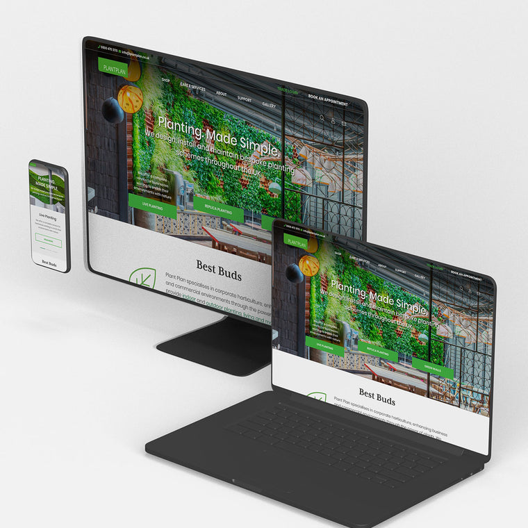
The range of browsers and devices we use to browse the internet is constantly expanding. This is our minimum level of device testing and support—although we're more than happy to include more if you require.

Browser support levels
Web Development
In order to complete our internal testing, we will produce a test plan, which is bespoke to the project. Two developers will work through this plan to ensure all areas of the site function as intended.
Once all in-house testing is complete, we will make a copy of the test plan available to you so that you can carry out similar tests (if required) using the development version of the site before the site is launched.
We support the current and one previous version of Chrome, Firefox, Safari and Edge on the latest Windows and OS X. For mobile devices we support the same level in Safari for iOS, and Chrome for Android.
Note – if you require your site to be compatible with any additional browsers / operating system combinations, this can be provided at an additional cost.
HTML Email
HTML email templates go through internal testing across a number of email clients, browsers and devices.
We offer two types of HTML email template, which are standard and responsive. We support the following clients, devices and browsers when developing HTML email templates:
Standard (Non Responsive)
- 1. Desktop
- 1. Outlook 2010, 2013, 2016
- 2. Thunderbird
- 3. Apple Mail 10
- 2. Mobile
- 1. Android 8.0.0
- 2. iPhone 6s (iOS 10), iPhone 8 (iOS 11)
- 3. iPad (iOS 11)
- 3. Web based
- 1. Outlook.com (Chrome, Firefox, Edge)
- 2. Gmail (Chrome, Firefox, Edge)
Responsive email support is for mobile device's native email clients, where stated responsive states will be seen, for other clients which do not support responsive states the standard email will be shown. Both standard and responsive state designs will be provided prior to development for responsive HTML email templates.
- 1. Desktop
- 1. Outlook 2010, 2013, 2016
- 2. Thunderbird
- 3. Apple Mail 10
Note – if you require your email to be compatible with any additional email clients, this can be provided at an additional cost.
CONTACT
Let's discuss the next steps for your new project!

CASE STUDIES

Fired Earth - Shopify Plus
Fired Earth’s move to Shopify Plus marked a major transformation for their B2C and B2B operations, streamlining their product catalogue and delivering a faster, more adaptable eCommerce experience, supporting growth and enhanced customer engagement.
-
Shopify

Carluccio's Coffee Subscription
Discover how we helped Carluccio’s transform their online coffee products, creating a bespoke design, unique user journey and efficient user experience, resulting in an eye-catching subscription service, seamlessly integrated with their Shopify site.
-
Shopify
Enter your email address to sign up to our newsletter, featuring case studies, insights, industry news and much more.
